Diabetes Design Initialtive,
Redesigning Medicial Device User Experience
2 min read
Project at a Glance
Problem
Type-1 Diabetes patients live in a state of constant self-monitoring using Continuous Glucose Monitoring devices (CGM) connected to an app. Such connection can be constantly unstable (e.g. experience signal loss) and Dexcom received tons of tech support calls from users for this, which is both high cost for our stakeholder and bad experience for patients as their daily lives are subject to frequent interruption as a result of their health condition.
Solution
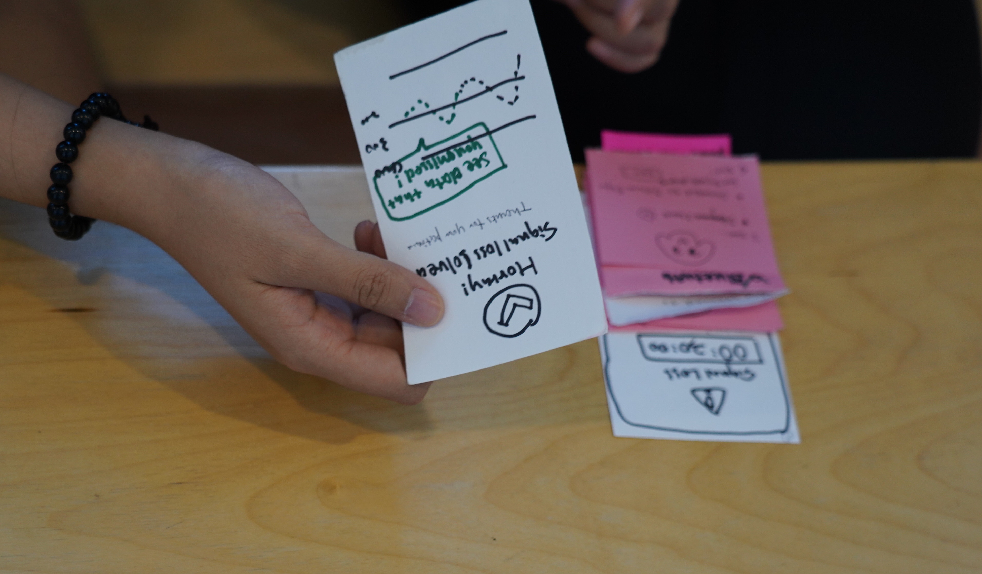
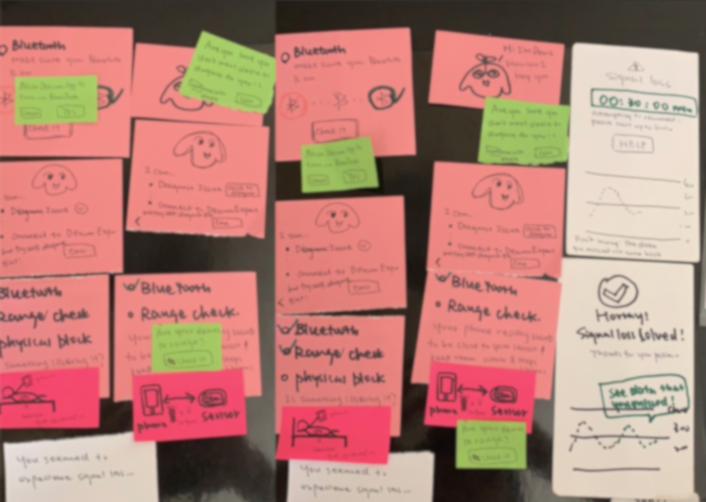
We aim to provide a redesign that help users better in-app self-troubleshoot when experiencing signal lost. We made an interactive checklist with the information hierarchy that was solidified by UX research and testing.
Impact
- The tech support call volume reduced 23%
- SUS usability score for our redesign improved from 53 to 74
- Dexcom Inc. will ship it in a year
Stakeholder
DDI team from Design Lab partnered with Dexcom, Inc., a company that develops, manufactures, and distributes continuous glucose monitoring systems for diabetes management. We aim to empowered diabetes patients community through ideate, interact with users, iterate, and improve, generating a clickable prototype at the end of the 7 one-week sprints.
My Role
UX researcher,
Product Designer,
Humble learner from the patients.
NDA
All of our prototypes and design solutions are currently protected under NDA (Non-Disclosure Agreement) and Dexcom needs one year to ship.
But I am willing to share some high-level thoughts with you.
Percent of Patients
Check their diet using the app
Percent of Patients
Decide insulin intake using the app
Percent of Patients
age >= 65 yr old
Percent of Patients
reported high complexity of the app
Current Solution
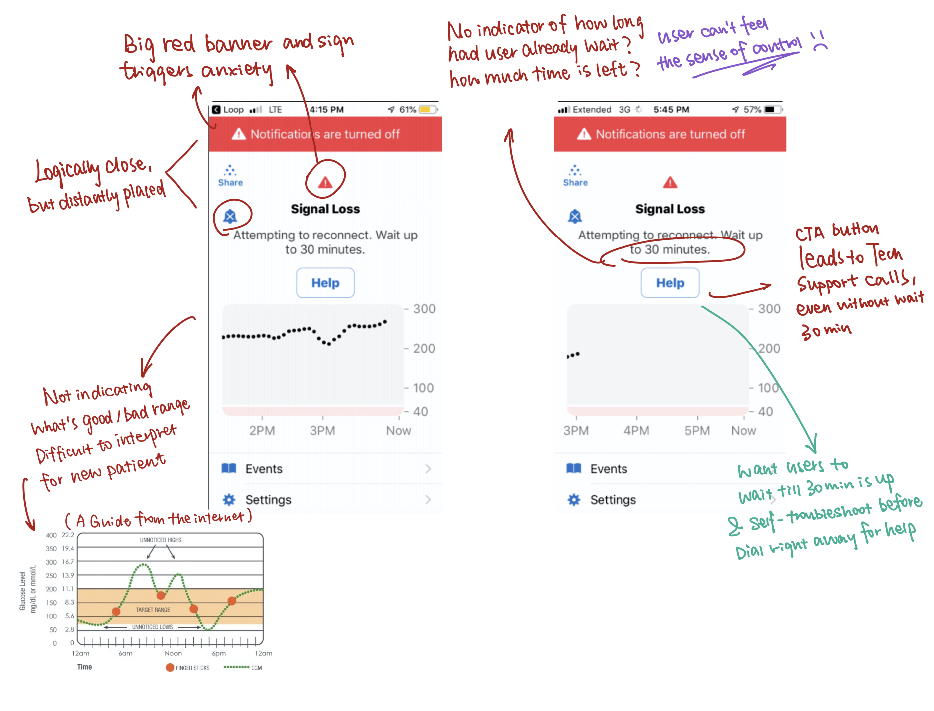
I found this current interface when experiencing signal loss
elicited user anxiety and had no pointer / signifier of how to actively resolve the problem.
How we trying to improve
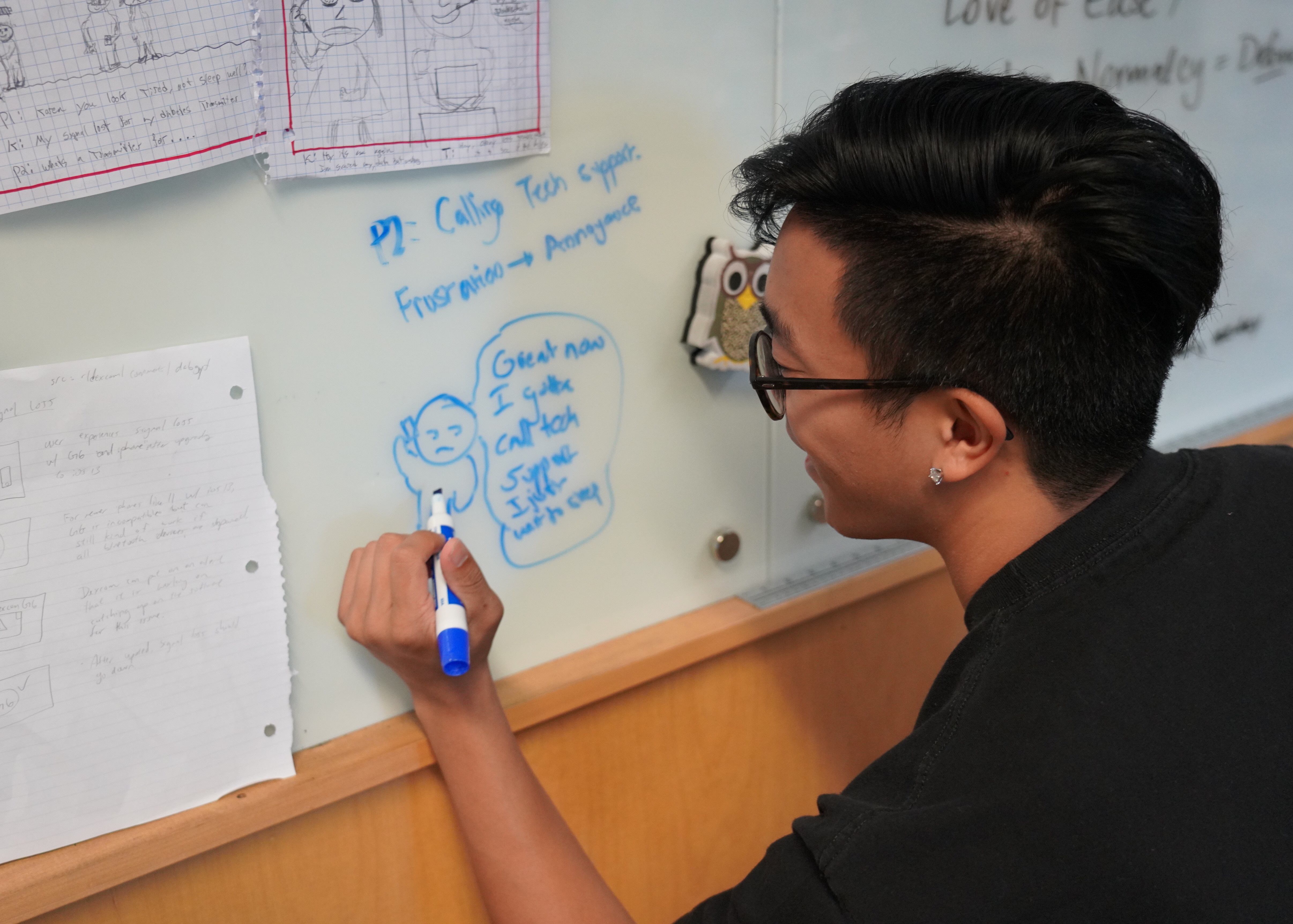
through Human-Centered Approaches :D
Attention to Accessibility:
Diabetes patients at a heightened risk for
" Diabetes is the primary cause of blindness in adults ages 20 to 74; blurry vision caused by Cataracts;
Colour vision is altered in 50% of diabetic patients, with or without diabetic retinopathy ( damage retina, where cones resides )."
Thus, We made sure our design is compliant to WCAG 2.1 guidelines in achieving AAA standard,
font & target size/distance, correct label and focus point, etc.
UX Methologies
Our research participants recruited varied greatly in age,
familiarity with the Dexcome CGM system & app,and age fighting diabetes.
We uncovered essenial user needs & pinpoints that constantly inspire our design iterations.
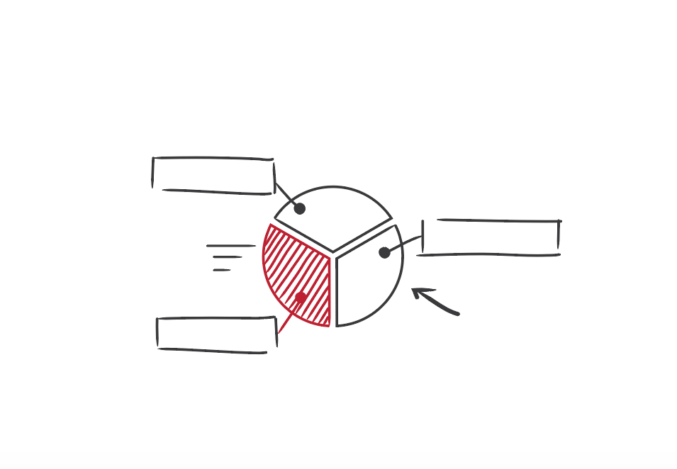
Audience Segmentation
encapsulate sets of characteristics, needs, and behaviors
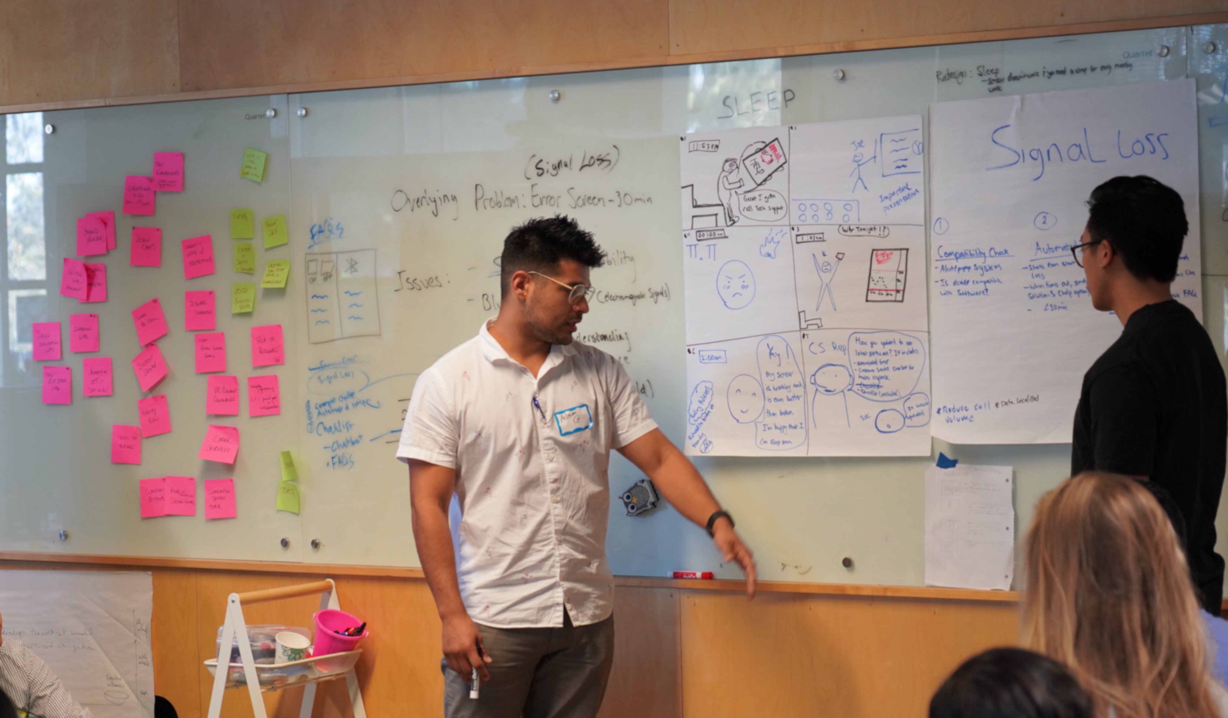
Our Team identified common patterns that stand out from the typical noise in our user data gathered through user interview and internal user data from Dexcom Technical Support Department, helping me to turn raw user data into insights about the underlying forces influencing user behaviors.

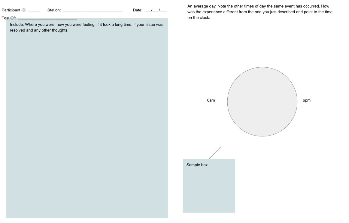
Customer Journey map
user experience recall
I created Day-in-Life customer journey maps to better know user actions, situated emotions, motivations, and pain-points. Then together with the team, we walked through the journey map with each persona and constantly work in progress to help identify the gaps and opportunity for streamlining customer journey further.
Usability Testing
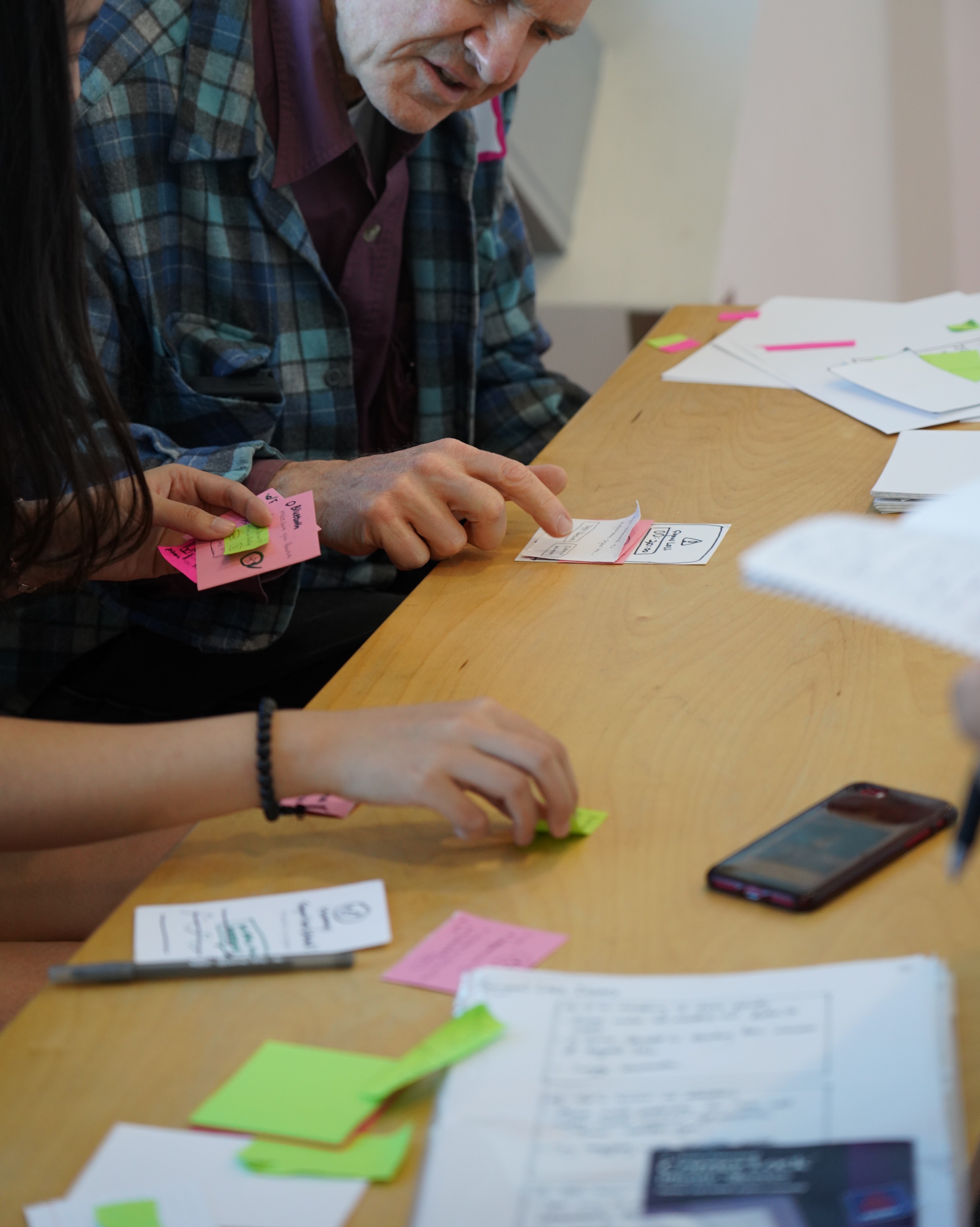
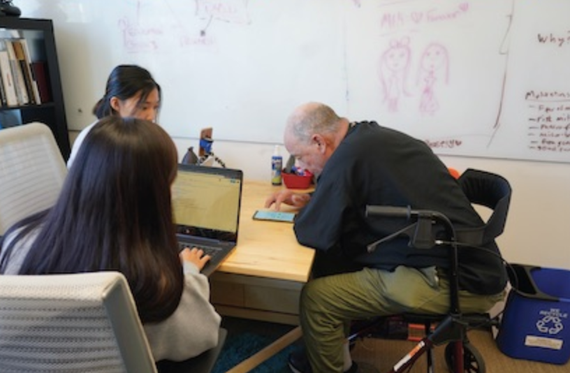
While doing user testing, I noted the path and time to complete the givien task;
I monitored success / failure rate, marked where users tend to click intuitively;
and where the system deign does not align with the user mindset.
A/B Prototype Testing Script
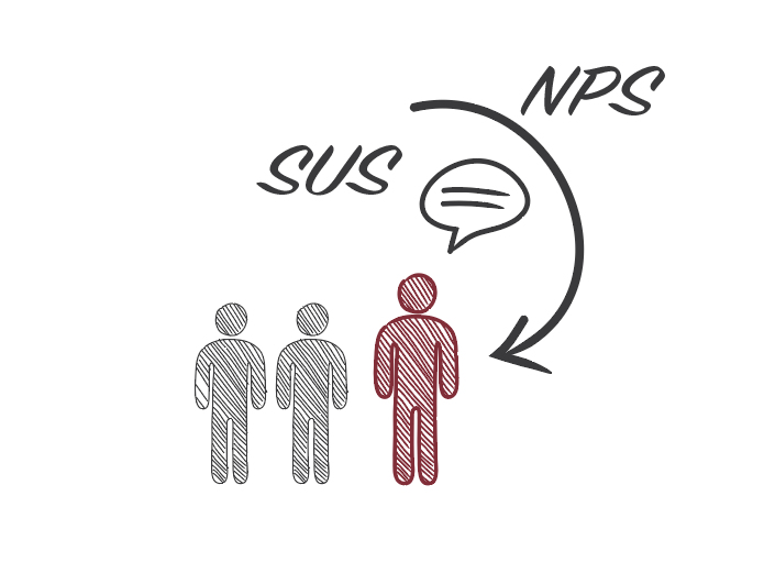
out of 100 for Average SUS (System Usability Scale) score for our redesign.
(SUS score above 68 would be considered above average)
Improved from the SUS of the previous DIAL solution's 53.75.
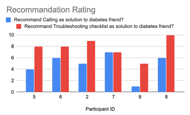
Takeaways.
Unfamiliarity is a Friend
Before I started on this diabetes project, I once though designing for users in a field you know little about is INTIMIDATING. But now I realized how unfamiliarity is a friend: you don't have any pre-existing assumptions to biase your design, and you can better empathize with your user as long as you humbly approach users needs & painpoints with complete UX research process: listen, empathize, and solve their problem with considerate design solutions.
Empathize with Real-world Users
I appreciate Dexcom brought the opportunity to interact and test our design solutions on individuals with type-1 diabetes recruited by Dexcom. I was able to listen to their own stories of daily battling with the inconvienice brought by the disease, and try my best to empasize with them. Their age group ranging from 6 year-old to elderly, giving me valuable feedbacks and reallife constraints they faced to help me better iterate the design.
Have Timely Communication with Stakeholder about Constraints
I realized how timely communication of the needs and constraints on the side of stakeholders is essential: Our skate holder has the appeal to preserve the overall original design users already attached to, in order to prevent them from having to readjust and accommodate to an unfamiliar user interface. My team didn’t realize such appeal until I pitched an early design proposal to the company about adding a countdown to the home screen as an accessible display to aid user’s understanding of the troubleshooting wait time. We were glad we did timely communication at an early phase and made adjustment without further cost.
Articals about us.
Inject User Trust into Diabetes Management Technology
Diabetes Design Initialtive
The Official Site
meet the team
I am extremely proud of my team for our final solution which is well-received by both Dexcom and end-users we apporached.
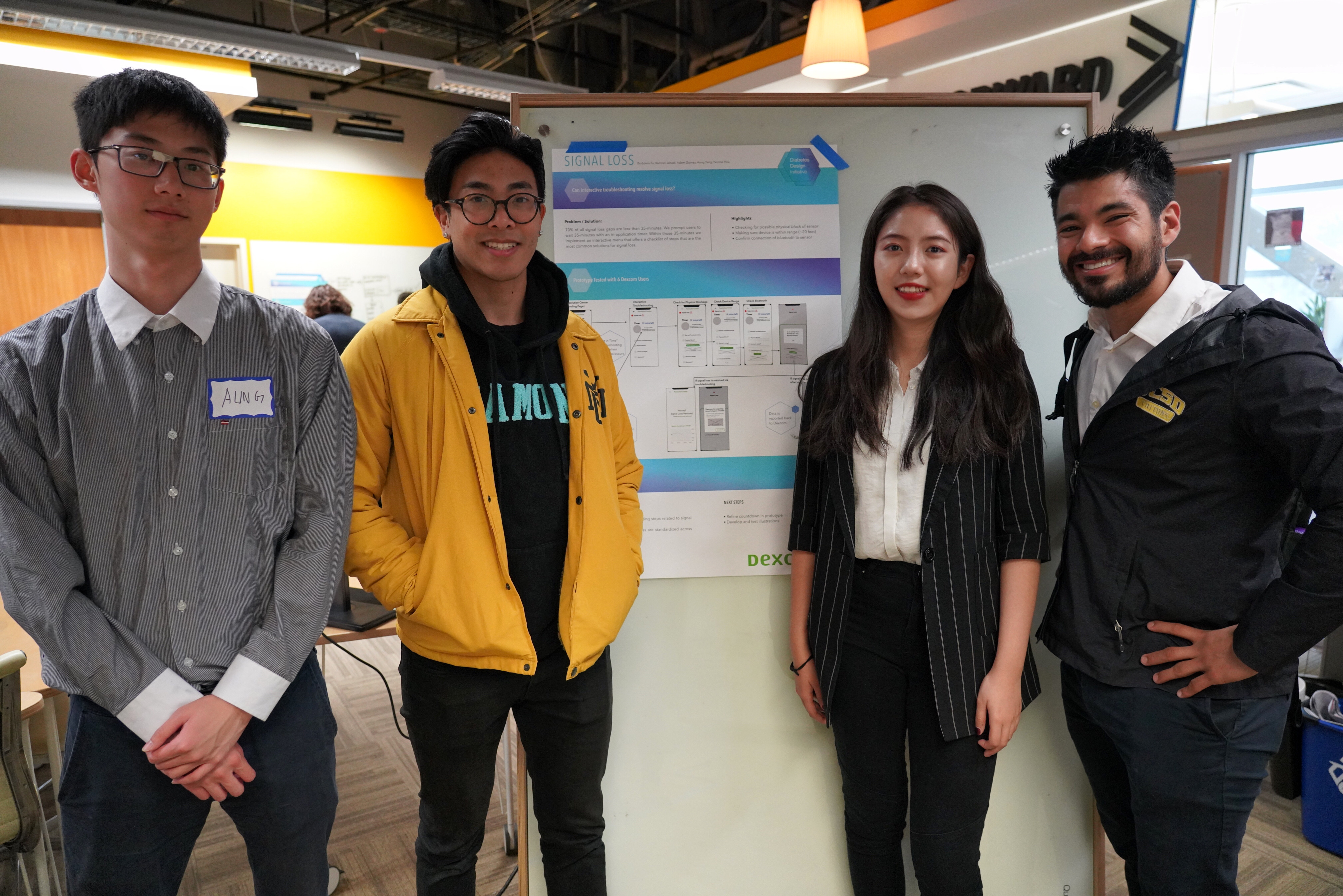
Shout out to my amazing teammates: Adam Gomez, Aung Yang, Edwin Fu and the efforts they put in!
