2 min read
Project at a Glance
Problem
In an autonomous ride-sharing experience, passengers with disabilities will be situated in cars without human driver assistance to adjust car controls.
Audience
Visually impaired users;
Wheelchaired users;
Anyone who prefers multimodal interactions during a ride.
My Role
Conversational designer
Key contributor in a voice team of 3.
Responsible for designing end-to-end conversation flows and integrating VUI to allow passengers with physical and/or sensory disabilities to interact with autonomous car controls.
Domain Research
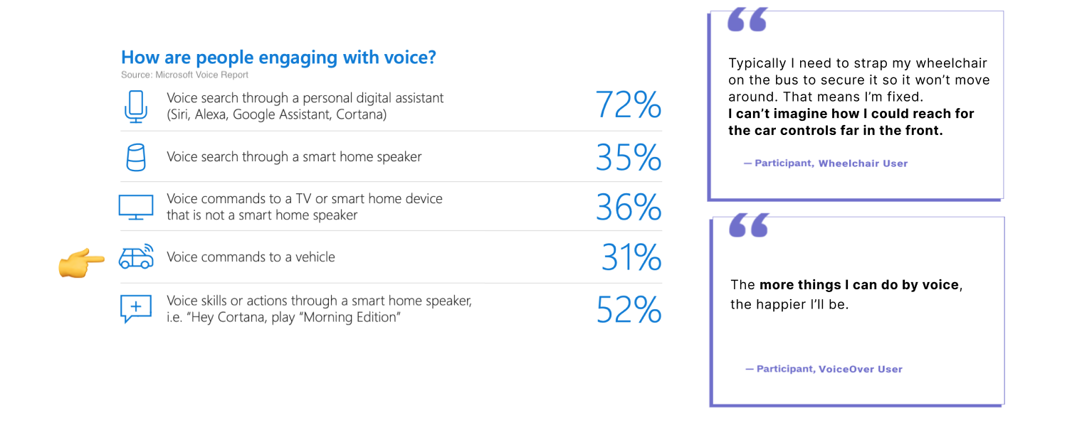
Why Voice?
Types of voice assistant
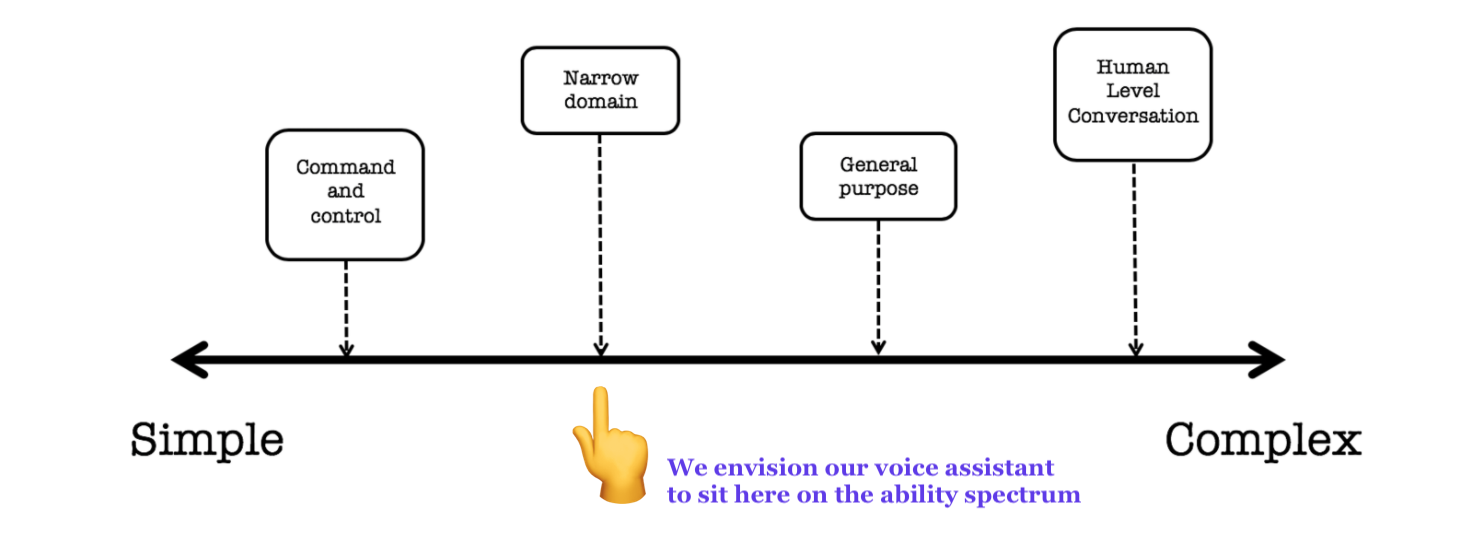
Our VA works in the specific domain of vehicle
and supports dialogue back and forth with users to complete the desired task.
How to interact?
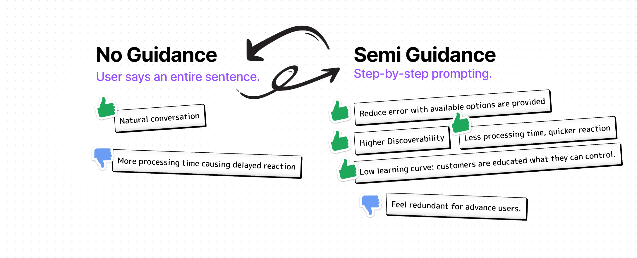
We strive to “fill in gaps” based on user response
while supporting step-by-step guidance for novice user.
When the user speaks a command, system will detect its key words
to see if they match all the required fields for a feasible action.
If not, the system will ask follow-up questions to complete the command.
Design Dialogues
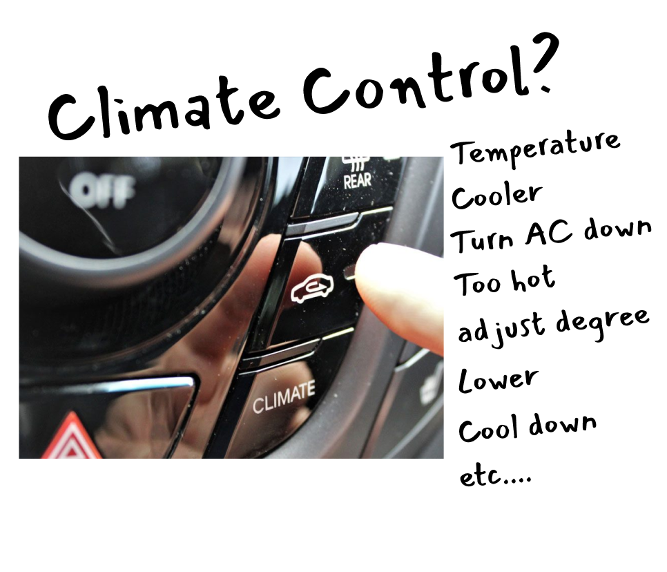
Familiarity:
Use natural names and their variations to refer to car positions and controls, rather than car terms.

Privacy:
Is my Voice Assistant listening all the time?
A user should know when an assistant is listening through visual cues and non-verbal audio cues. Also, user should easily revoke assistant access when inactive.
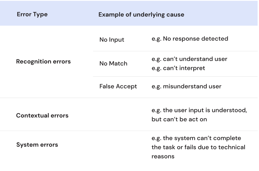
Error Handling:
Keep Recognition error response general and re-prompt, leaving out the cause to avoid being preceived as accusing.
Escalating detail for Contextual and System errors.
A voice assistant that anticipates error conditions and provides graceful and robust error-handling instills user confidence. I brainstormed this table of error types and related user scenarios when things don't go as expected.
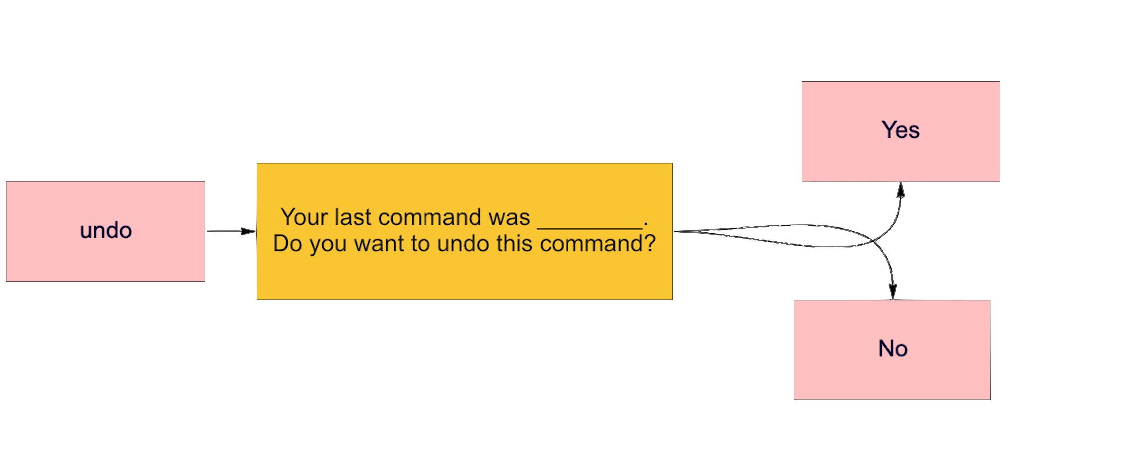
User Control:
Quick Recovery from undesired command
The ability to "Undo" a previous command is important. Also, instead letting the user recall the last undesired command, I designed an additional step into the Voice interaction to double check the previous command and ask for double confirmation.
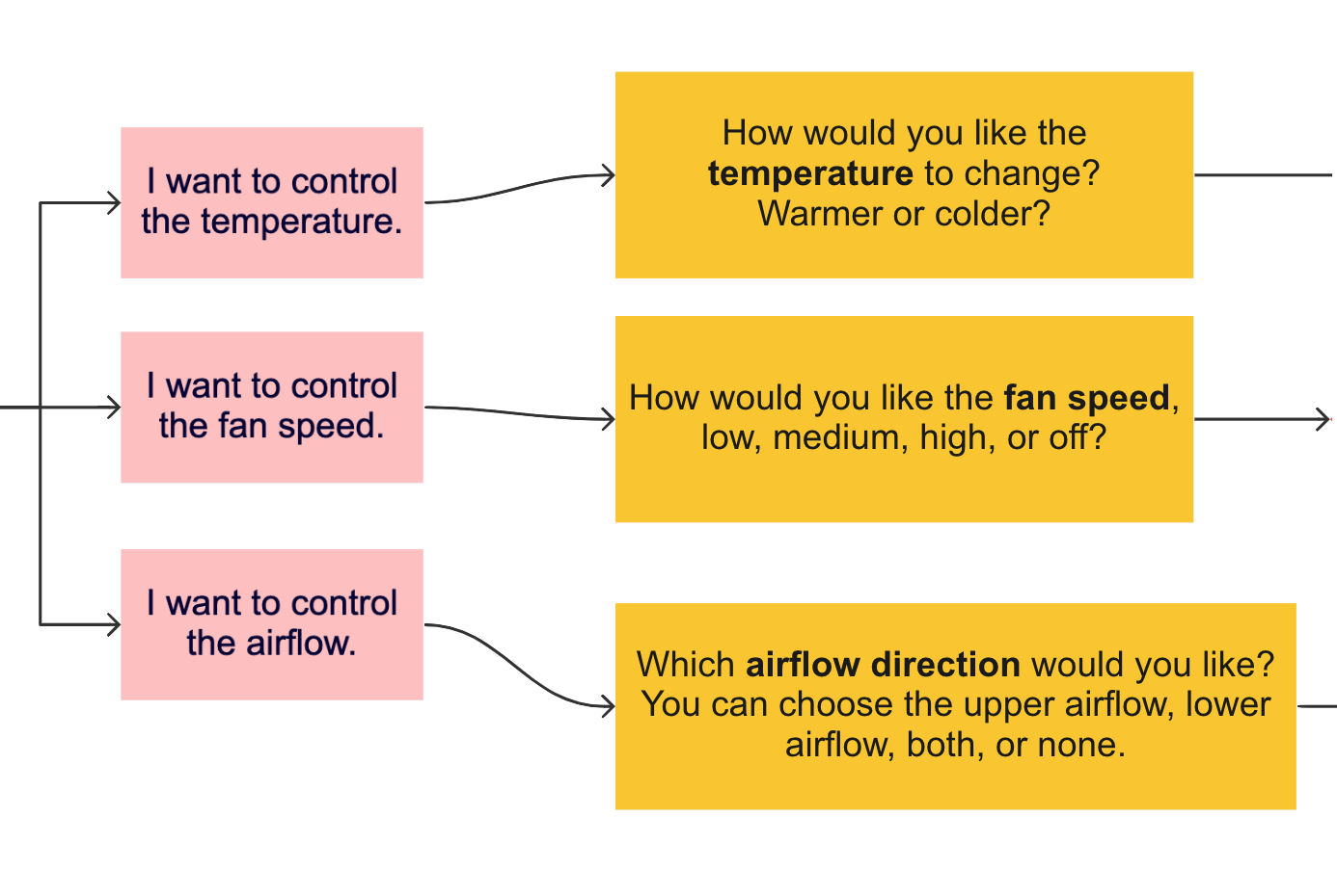
Implicit confirmation:
Letting the user know what was understood without burden them with an extra step to confirm.
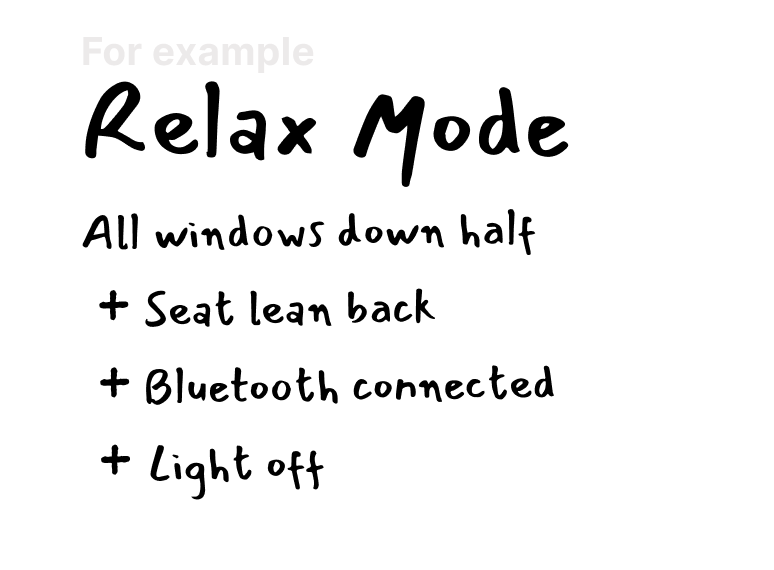
Allow users to tailor frequent actions
Pre-configured modes that mix-and-match different car control status provide shortcuts via voice.
Mapping it out
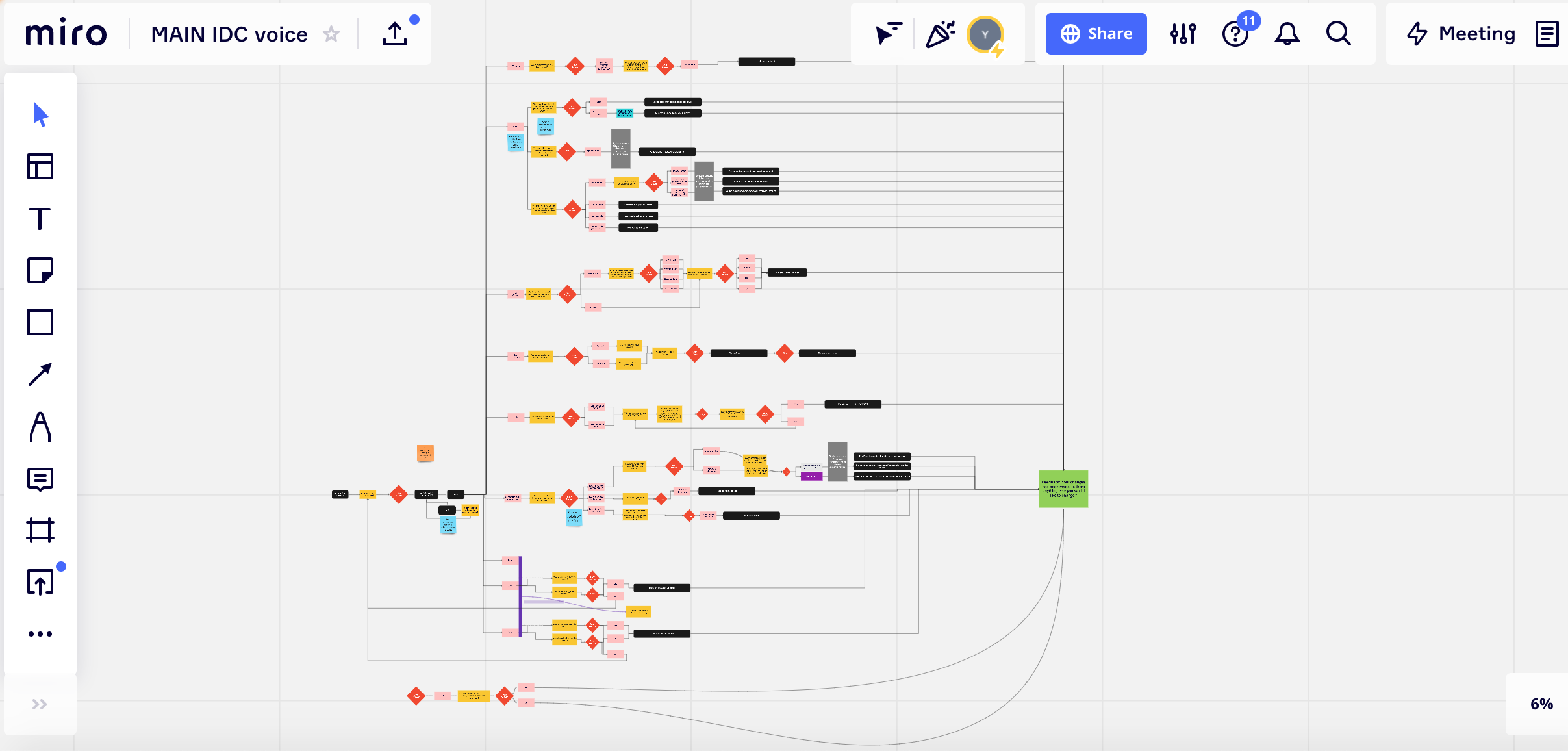
Flow Diagram
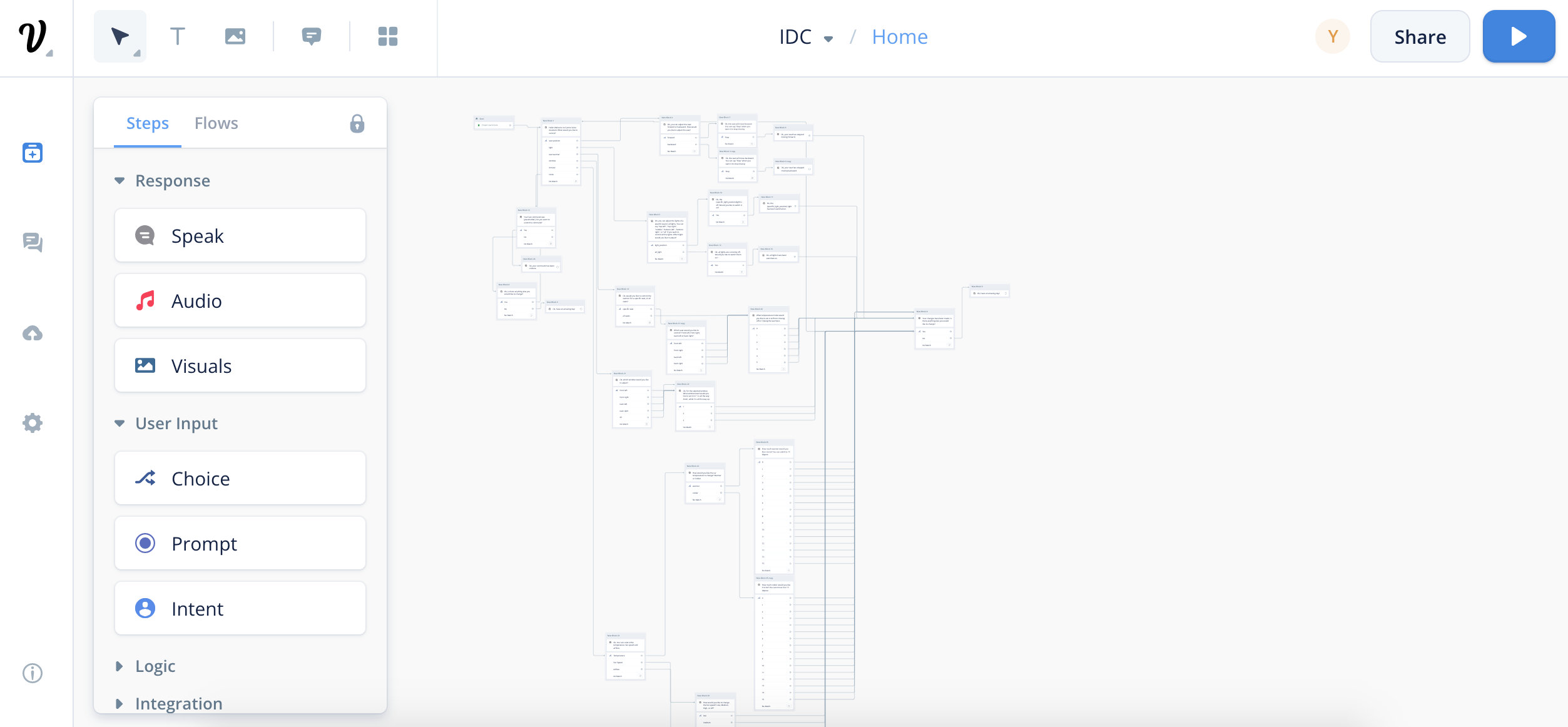
Voiceflow Prototyping
Based on the revised command flow diagram above,
we translated the static diagram into
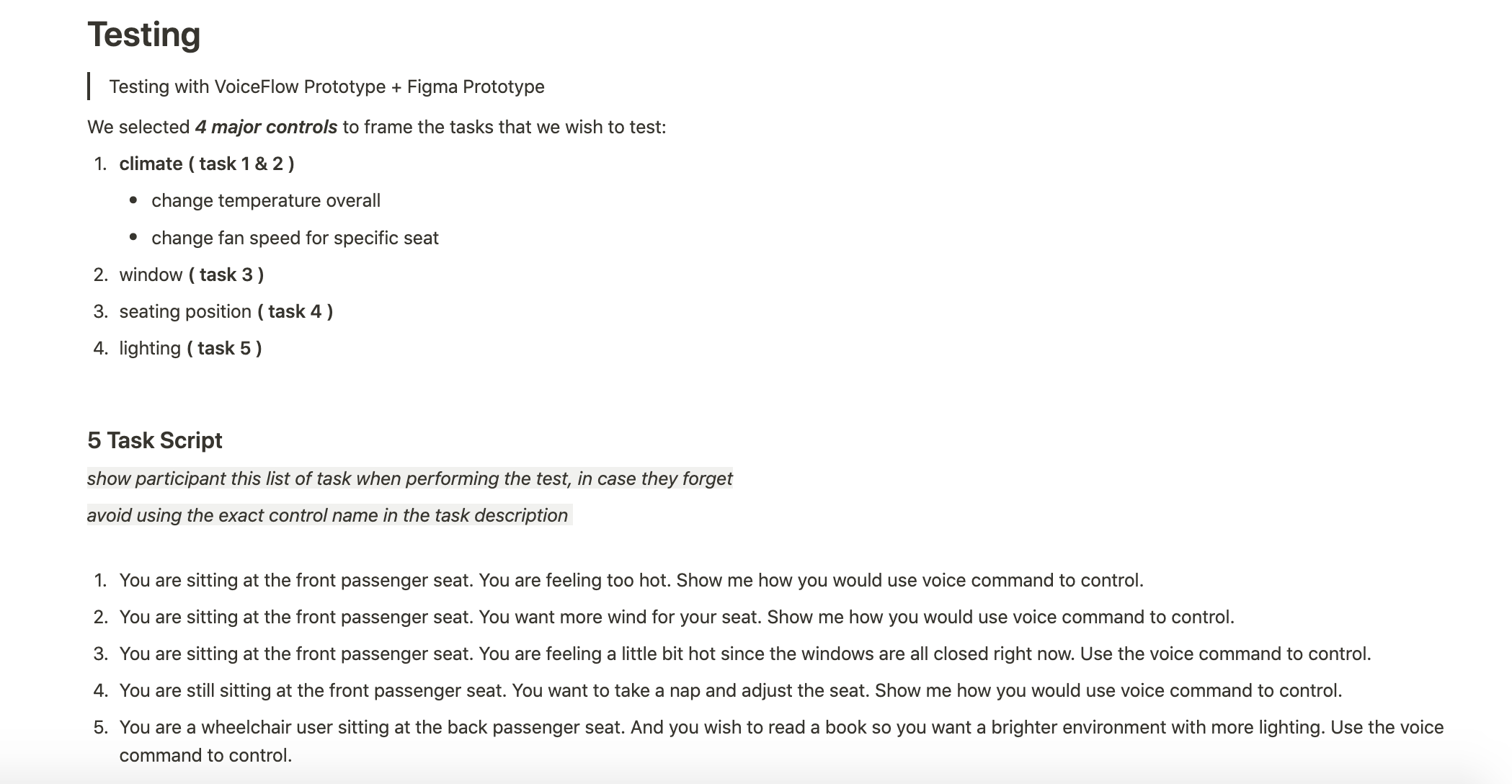
an interactive voice prototype using VoiceFlow for future user testing.
Voice Forward, Not Voice Only
Voice User Interface(VUI)
Multimodal Interaction
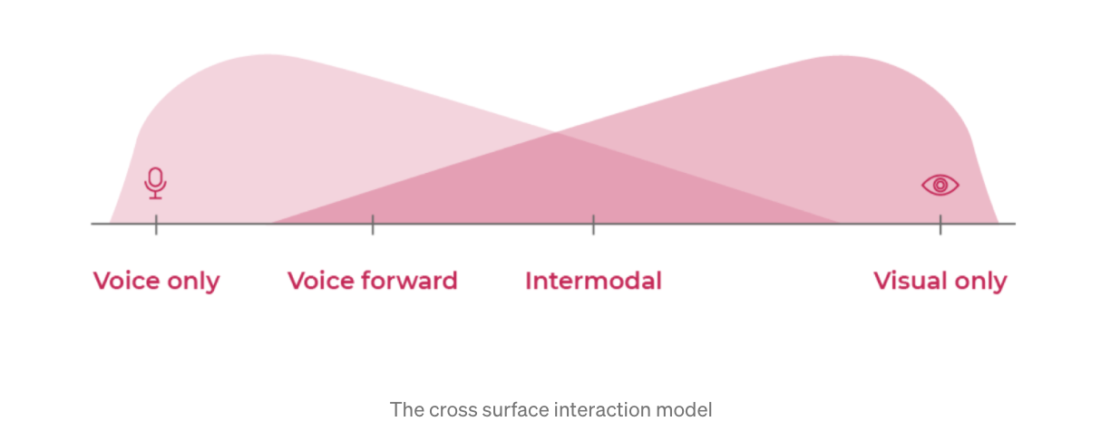
There is not one means of representation that is optimal for all.
While the voice assistant allows passengers to have full control through voice only,
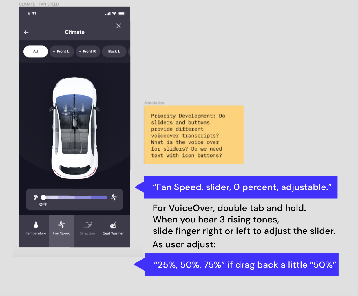
visual information can still be presented to augment the interaction.
2 Ways to access VA

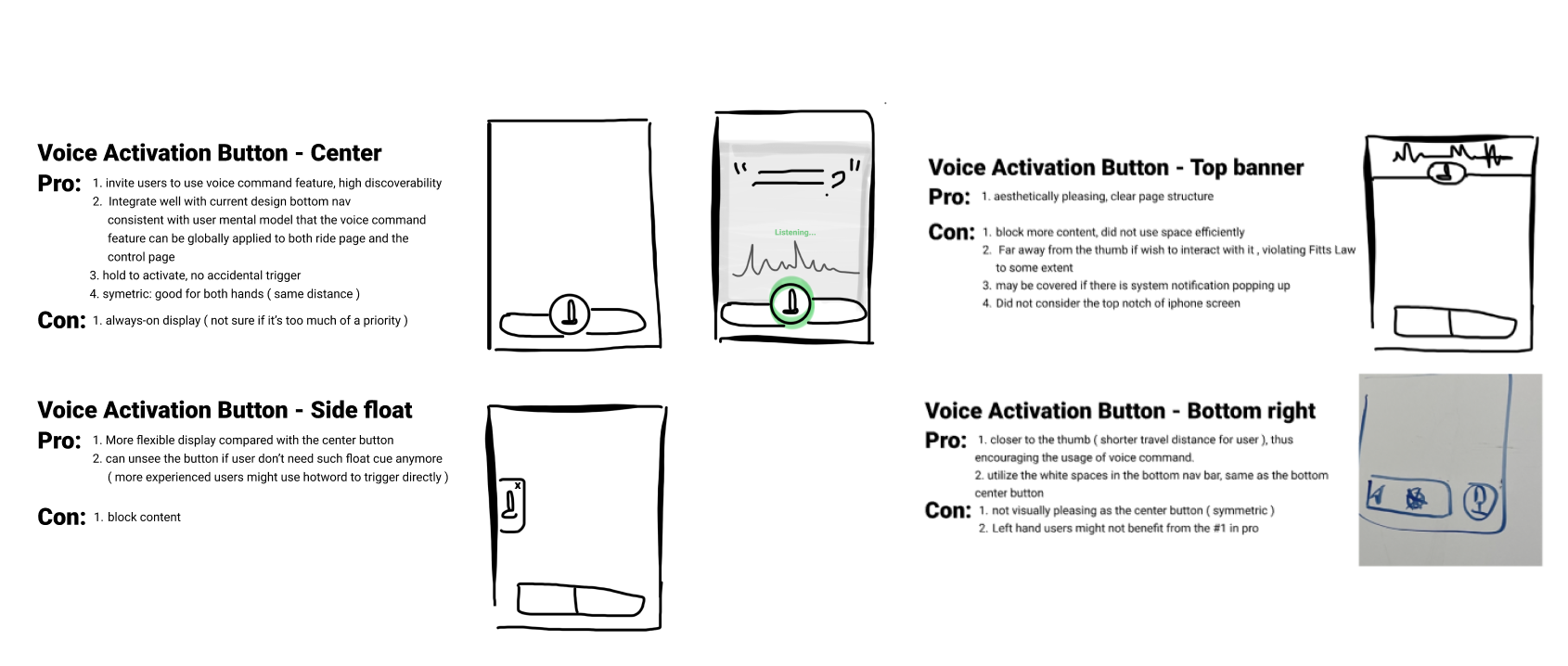
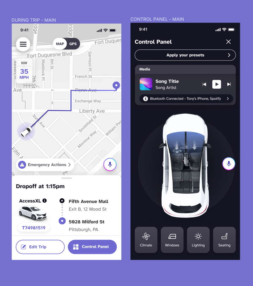
conversations don’t exist in a vacuum,
but in the context of a broader interaction.
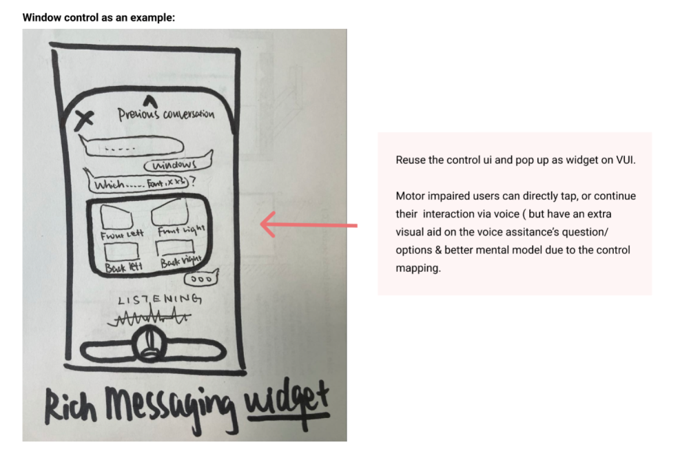
Rich Messaging
From competitor analysis, we found out that major voice interaction-based products embodied such concept.
For instance, both Apple and Google have interactive content cards showing images, descriptions, and CTAs beyond simple text-based chat.
Therefore, I adopt rich messaging not only to embrace multimodality,
but also to reuse established design pattern that users are already familiar with.

What are some design thoughts
around Conversation Page?
Dark Mode
We employed dark mode since it is more accessible to the audience we serve.
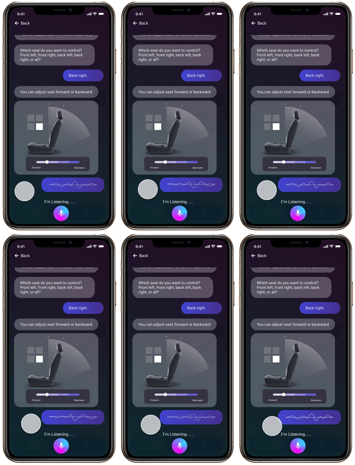
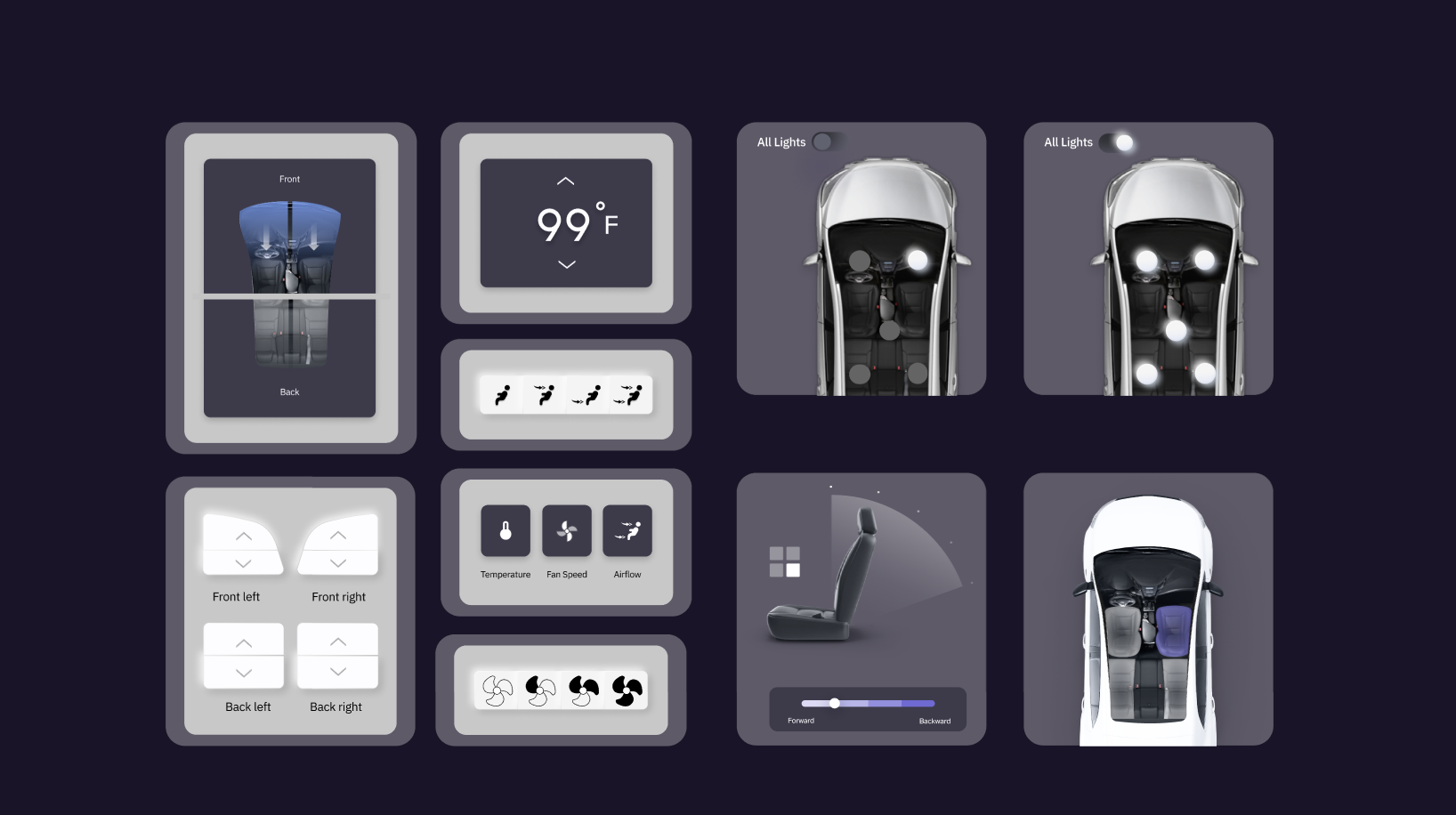
Control Widgets
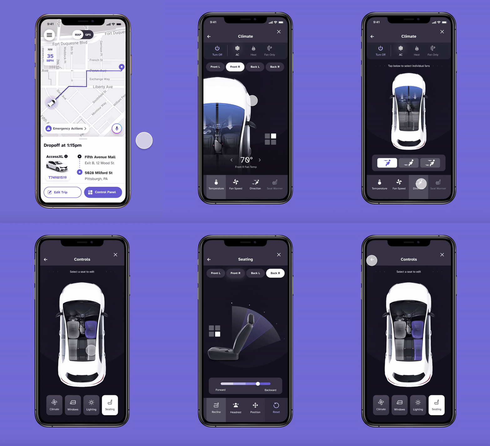
The car control widgets will synchronously show on the UI as the voice assistant is interacting with the user via audio. They serve as an alternative to aid user interaction.
Also, consistency is maintained throughout the design system, aligning widgets visual style with the app & car screen.
Listening State
Listening state helps users easily identify if the system is ready to interact with them. Moreover, it increases the privacy aspect of the product as the UI also indicates when it's NOT listening / inactive.
High-Fi Screens &
Key Accessibility features
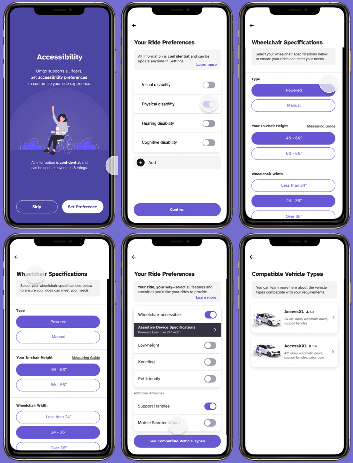
Onboarding guides users to tailor ride experience according to their needs.
Ride Preferences pages can be accessed during onboarding or Settings, increasing customization while minimizing the information users would need to provide.
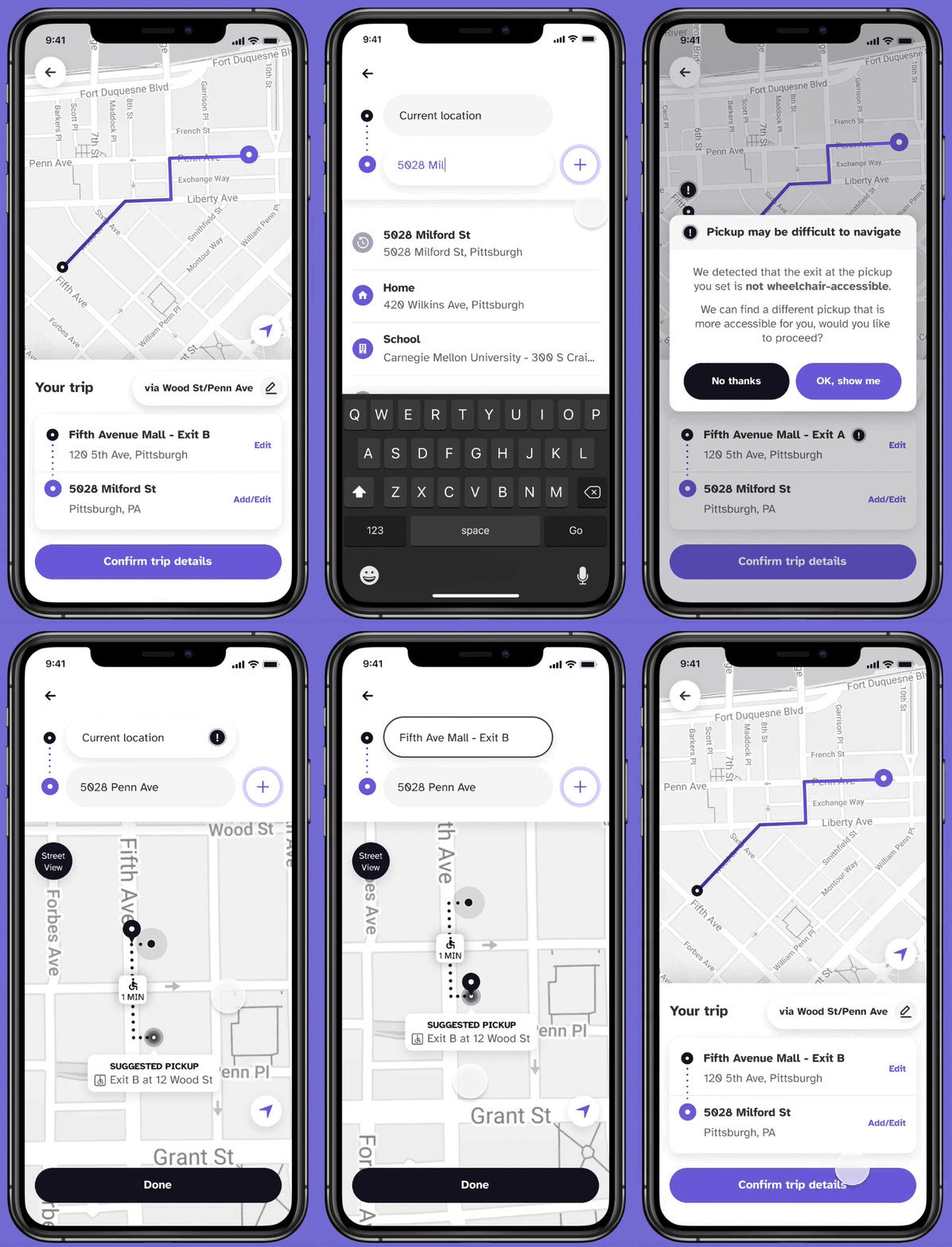
Pickup & Dropoff:
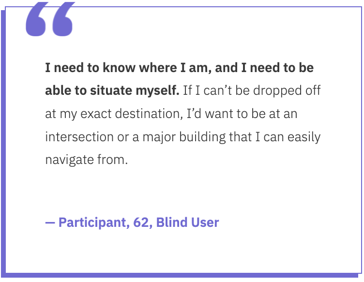
Unigo incorporates feature to recommend more accessible location.
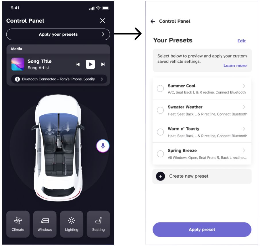
Pre-configured modes that mix-and-match different car control status provide shortcuts via voice for a richer and personalized experience.
Can be activated during the setup process, or later through Settings and control panel.
Iterate & Test
Ongoing testings, expect updates soon!
